

Case study · Design systems & governance
Building ACV’s Design System From the Ground Up
When I started at ACV there was no design system. Designers built screens by copying other screens, or rebuilding patterns that already existed somewhere else in the product. Every new experience was a fresh act of recreation — and as the team grew from 2 to 12, the cost of having no shared foundation compounded fast.
A system isn’t really about components. It’s a shared language so a team’s work coheres — and a governed process so it stays coherent as the team and the product grow.

The gap: every screen was a fresh act of recreation
That works when you’re two designers. It stops working fast. The same component existed in five slightly different forms, screens drifted apart, and consistency depended entirely on everyone remembering how everyone else had done it.
So I built the first version. It was scrappy — not the governed, multi-library system it is today — but it was the seed: a shared place to define the patterns we kept recreating, so our work could finally cohere.

The architecture: one foundation, seven brands on top
That scrappy v1 matured into a real system with a clear hierarchy — a shared foundation with brand-specific layers, so one design system can serve many brands without flattening their individual identities.
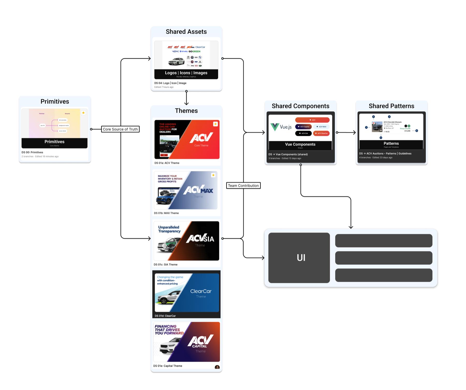
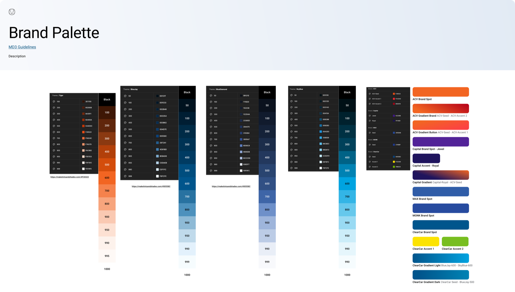
The foundation: color by role, not by hand-picked hex
Underneath the components sits a deep token and atom layer — everything built up deliberately from atoms → molecules → components → patterns.

Governance: a living system, not a one-time build
A design system is only as good as the process that maintains it. I helped build an intake-to-publish pipeline so the system stays coherent as it grows.
Request
a new component need comes in
Validate
does it exist? meet requirements? scale across products?
Design all states
the team mocks the component and every state
Build & test
reviewed with dev, built in a sandbox, tested
Publish
documented, signed off, shipped to the Design Kit, and communicated out
The result is a living, governed system. On an ongoing basis, each team updates roughly 1–2 components per month as requirements evolve.


The hardest component: the auction card
If one component proves why a real system matters, it’s the auction card — the most complex, most heavily customized component on the platform, purpose-built for ACV’s users and the business goals behind every auction.
Touches 8 experiences
One anatomy aligns information, structure, and layout across every auction card in SRP and My ACV.
Updated quarterly
Maintained by multiple designers against new requirements, on a governed update path.
Desktop & mobile guidelines
A documented anatomy: vehicle details, auction details, price/status, photo section, and location.
Six real states
SRP, Active Selling, Pending Proxy, Saved Auction, With Offer Reminder, and My Inventory.


The impact — real and measured
The system’s value shows up in numbers that are measured, not aspirational.
That last number is the one I’m proudest of: the system is what allowed the team to grow. Consistency at speed, across a dozen designers and seven business lines, doesn’t happen by luck — it happens because there’s a foundation holding it together.
A note on detaching
In Figma, an instance stays linked to its main component and inherits updates automatically. Detaching breaks that link — the instance can then be edited freely, but it no longer receives upstream changes, so it drifts from the source of truth.
A high detach rate means
- The system doesn’t cover real needs
- Designers break off to rebuild locally
- Work drifts from the canonical source
- Consistency erodes over time
A low detach rate means
- The component covers real needs well
- Designers trust the canonical version
- Updates propagate everywhere automatically
- The system earned its adoption
Every detach is a small bet against the system — watching that number fall from 20% to 11% was the strongest signal it was working.

Where it’s going: AI-assisted design
The newest chapter is exploring what a design system means in the age of AI. We’re experimenting with building components using Claude and maintaining a Claude Design library designers can pull from.
Need a component
a designer needs, say, the auction card
Pull from the library
Claude Design pulls the defined ACV component
Assemble on-brand
a full prototype from pre-defined, trustworthy patterns — idea to prototype, fast
This is an early direction, not a production practice — we’re actively proving it out. But it points at where well-governed component libraries get genuinely powerful: when the patterns are defined and trustworthy, an AI tool can assemble with them, and the leap from idea to on-brand prototype gets dramatically shorter.

In short
- Saw the gap early — an agency instinct to make a body of work look like one designer made it — and built the scrappy first system before fragmentation became a crisis.
- Grew it into an architecture: a 6-layer hierarchy, 7 + 1 libraries, and a token foundation built atoms → molecules → components → patterns.
- Made it governed: an intake-to-publish pipeline and ~1–2 component updates per team per month.
- Tamed the hardest component — the auction card, across 8 experiences and six states — with one anatomy and one update path.
- Earned adoption: detach rate from 20% to 11%, new screens 60–70% faster, and a team that scaled from 2 to 12 without fragmenting.


