Case Study — Interactive Design · 2012–2016

Bringing the joy of Fisher-Price to digital experiences.

A four-year role retrospective. Designing — and building — playful digital experiences across every brand under the Fisher-Price umbrella, in a pre-mobile-standard, pre-UX-as-a-discipline internet.

Role
Interactive Graphic Designer — design + front-end build, end-to-end
Type
In-house · Every brand under Fisher-Price
Disciplines
Storyboarding · UI · Animation · HTML/CSS/JS · Email · Social · Packaging · Games
Years
2012 — 2016 · Four formative years
02 — The role

Designing magical digital experiences where parents and kids could explore, learn, and discover the joy of play.

Officially: Interactive Graphic Designer. In practice the role spanned the whole production pipeline — storyboarding the experience, designing the visuals, animating the moments, and front-end building the result. One designer, the full chain.

1

Designed engaging web experiences for Fisher-Price products and campaigns

2

Built 40+ interactive games and playful digital experiences for children

3

Created promotional content across Toys"R"Us, Kmart, Walmart, Amazon and retail partners

4

Developed email campaigns, ads and social to support product launches

5

Storyboarded, animated and front-end built experiences end-to-end

6

Helped bring Fisher-Price's playful brand personality into digital

03 — The context

A different internet, a different toolkit.

In 2012, mobile-friendly sites were rare, social media was still new, and "UX" wasn't yet a role. Microsites were a vibrant, playful format you barely see today.

I worked at the front edge of the tooling — building animated HTML5 experiences in Adobe Edge as Flash was winding down. It was a moment when you could genuinely play with what a website could be.

You don't see many microsites today — but it was a time when a website could be pure play. — On the era this work lived in
04 — How the work began

Translating marketing into meaningful experiences.

Most projects started as a marketing request — promote a new toy, grow engagement with a brand or character, drive traffic to retail. But the real work started by asking: what does this mean for the parent, and what does it mean for the child?

The core value

What does the toy actually do? Learning, motor skills, imagination, social play. The promise underneath the packaging.

The target audience

Which age group is it for, and how should the parent and child interact with the experience together or apart?

The desired behavior

Play, explore, share, purchase. Every screen designed back from the action we wanted someone to take.

05 — My process

Six steps. Storyboard to ship.

The same shape ran through every microsite, game, email and animation — light enough to move quickly, structured enough to keep dozens of campaigns unmistakably on-brand.

1

Define the goal

Partner with marketing to understand the product, the audience (kids + parents), and the campaign objective.

2

Translate into concepts

Turn the brief into the right digital form: microsite, game, email or ad. Choose the format that fits the goal.

3

Storyboard the experience

Map the flow and interaction — the "UX" of the day. For animated builds, storyboard every beat before production.

4

Set creative direction

Collaborate on visual style, story and tone so it felt playful, on-brand and age-appropriate.

5

Build it

Produce high-fidelity design and front-end build the experience — often animating it in Adobe Edge.

6

Review, refine, launch

Run through the review chain (peer → director → marketing), refine, and ship across the campaign.

06 — Craft at volume

One brand, three designers, no Figma.

A real challenge: three designers, each with different skills and taste, all needing to produce work that looked like it came from one hand. And this was before collaborative tools — everyone worked in Photoshop, with no live co-editing.

The solution was a disciplined review process: we'd build, peer-review each other's work, review with the director, and only then bring it to marketing. That chain is how dozens of campaigns across every sub-brand stayed unmistakably Fisher-Price.

Brand consistency through process, not tooling
07 — Pushing the brand forward

Sometimes the job was getting ahead of the brand's comfort zone.

We introduced web patterns Fisher-Price had never used. When I brought the hamburger menu to the site, marketing worried moms wouldn't recognize it — so they hedged by labeling it "MENU." Once the pattern became a web standard, they dropped the label.

A small story, but it captures the role: a designer pushing modern patterns into a brand that was still feeling its way onto the modern web. We also began adding Fisher-Price's first mobile capabilities around the same time.

Menu
08 — Selected work

A slice of the four years. Microsites, animation, social, email, site.

Five projects from the broader body of work — each one a different lever pulled on the same goal: make the brand feel like play in digital form.

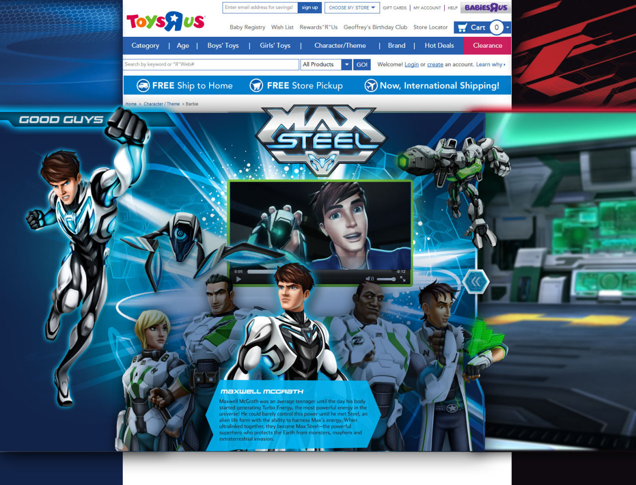
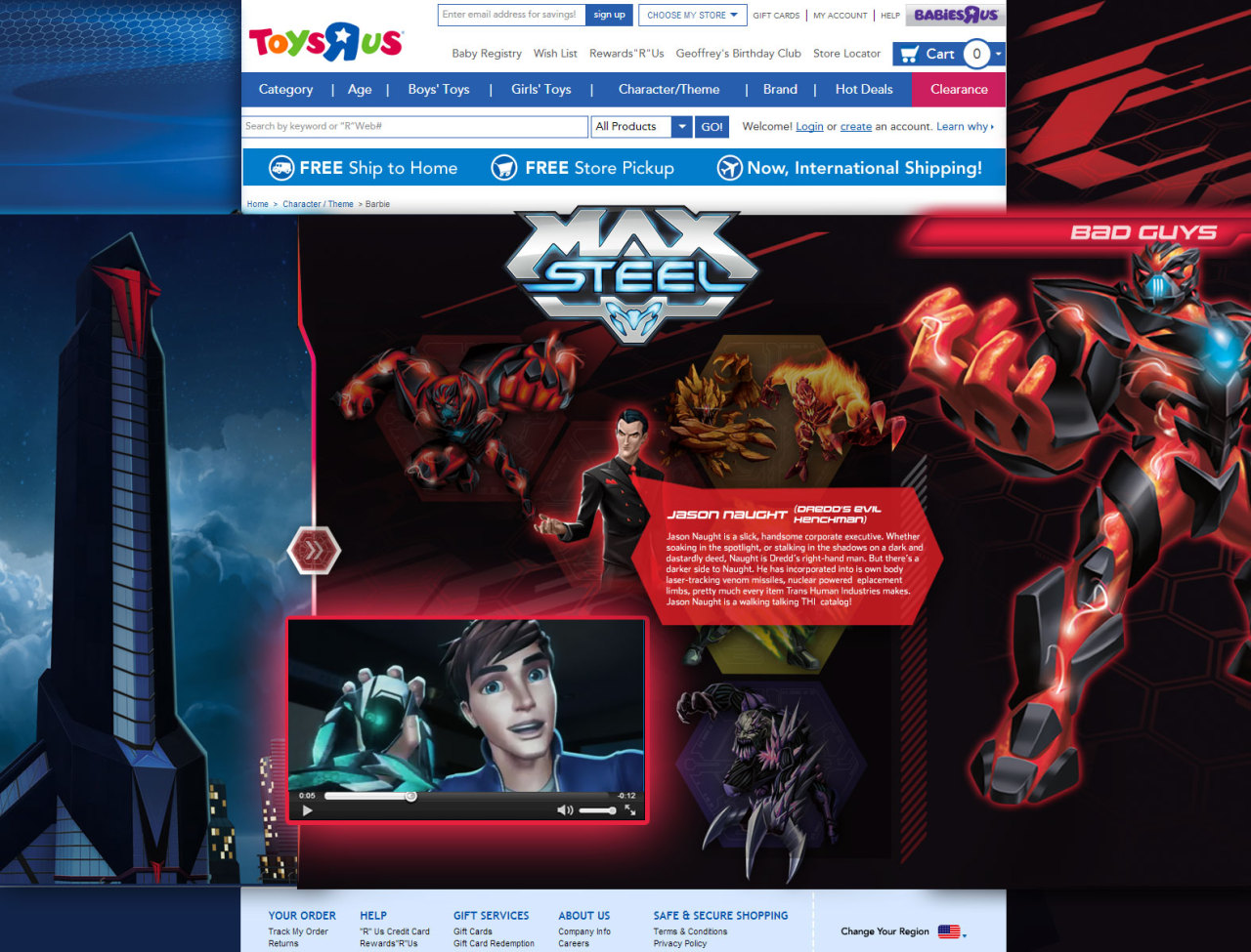
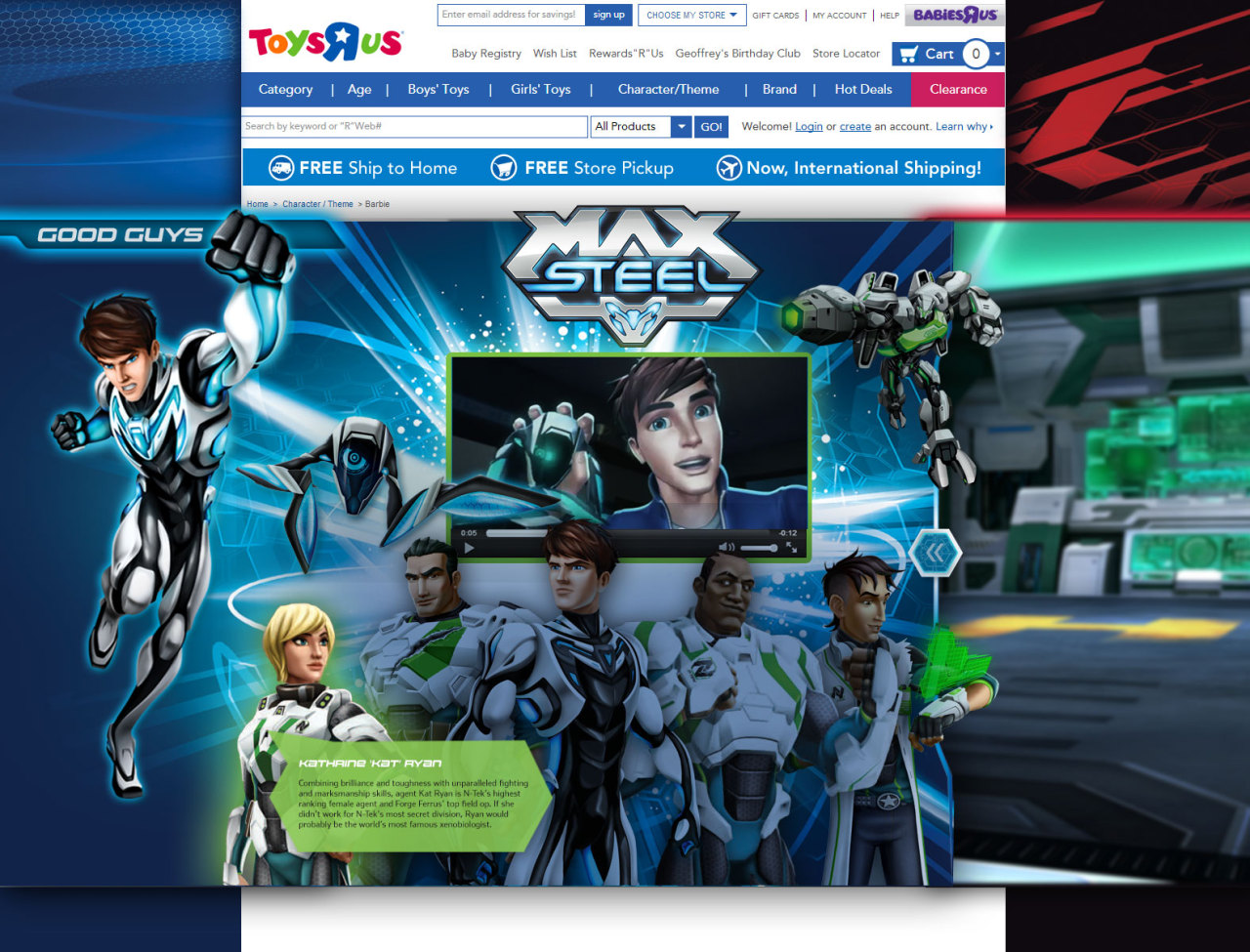
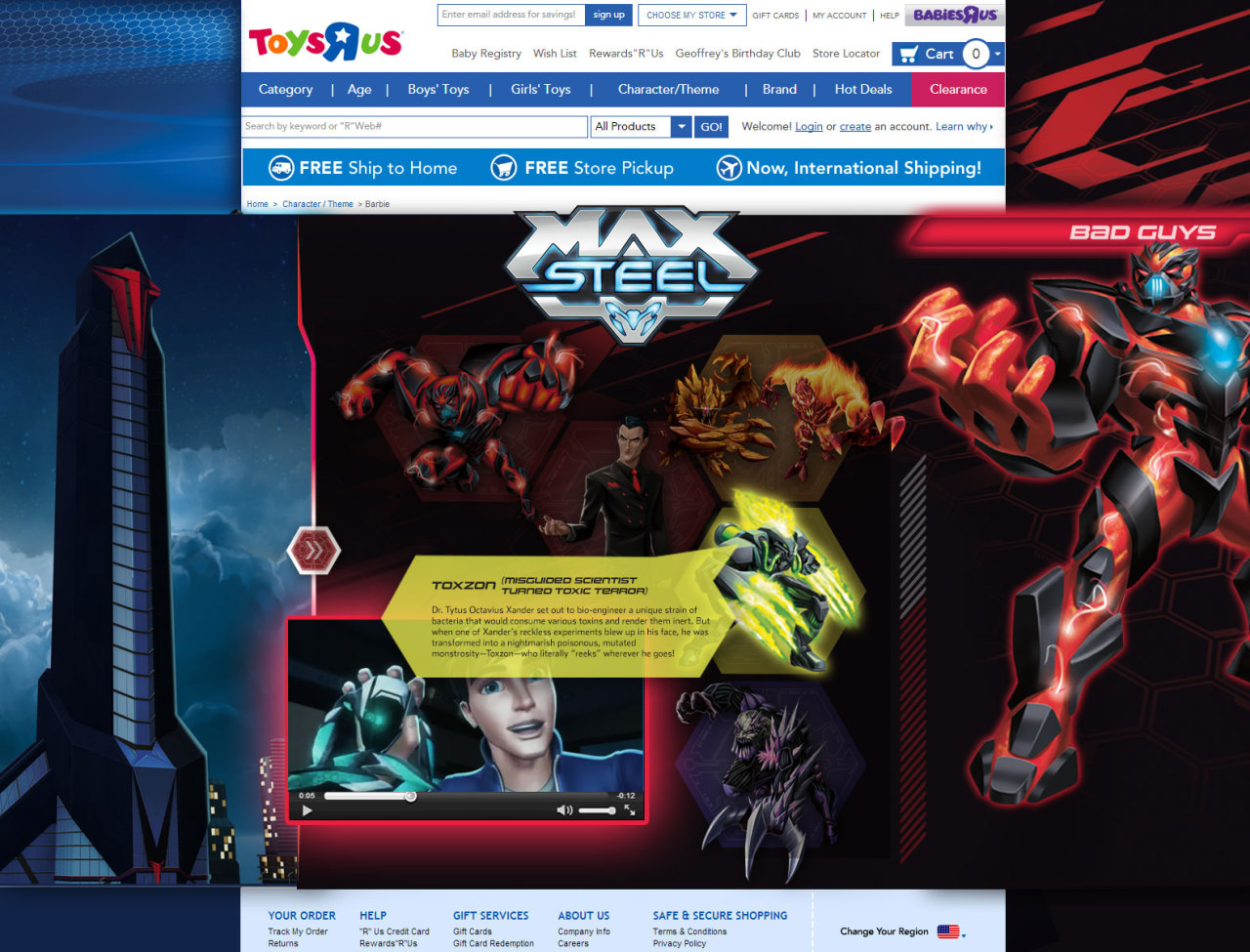
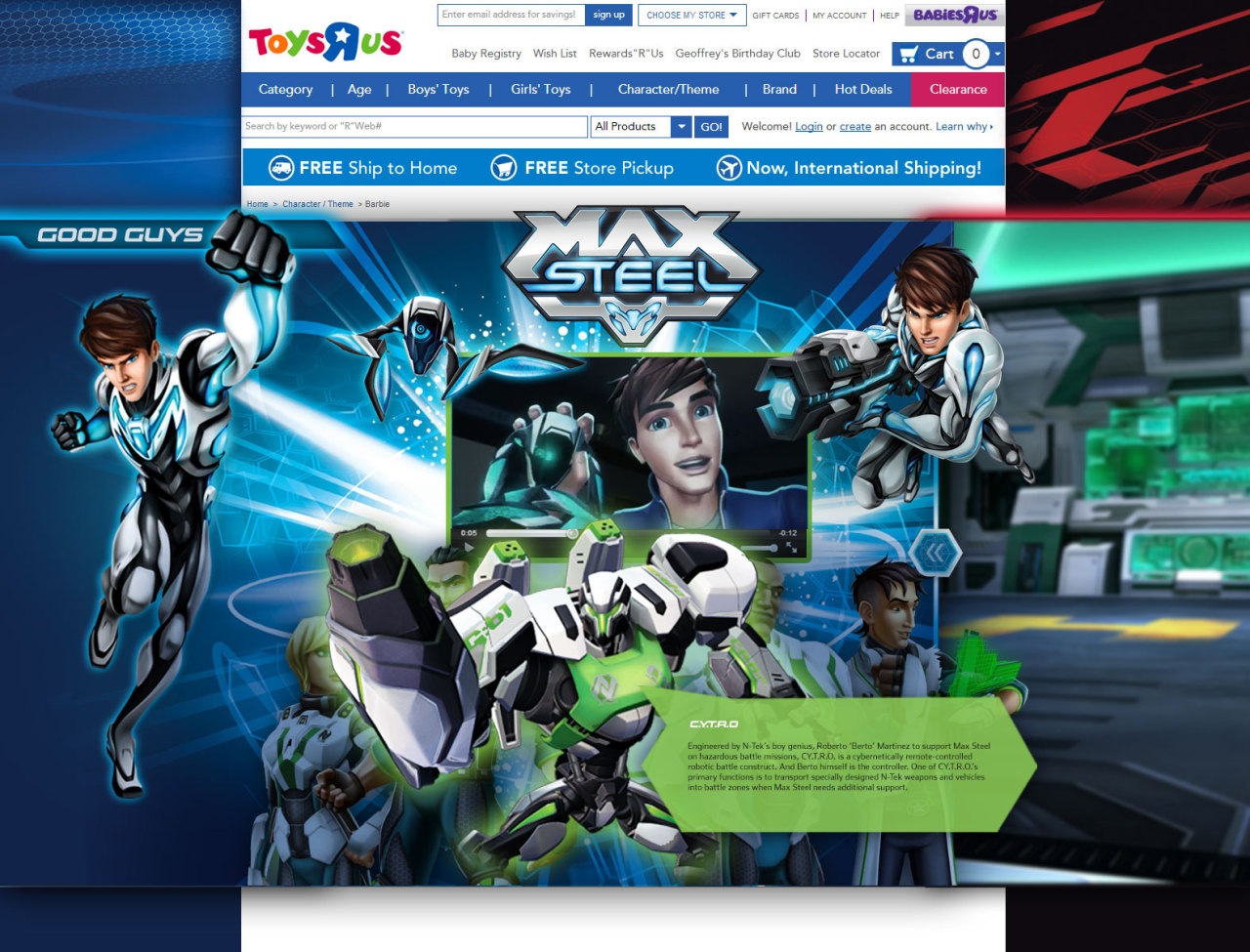
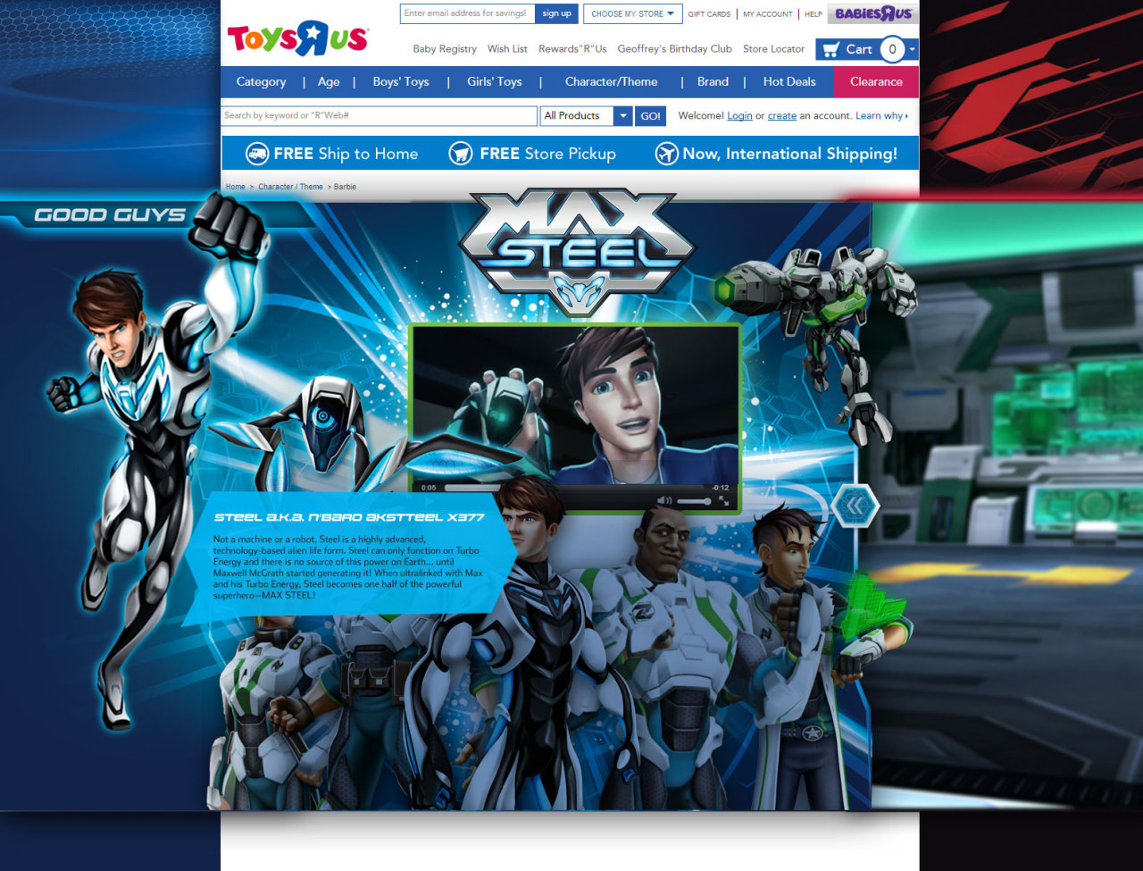
8a · Microsite + retail integration

Max Steel — play that leads to purchase.

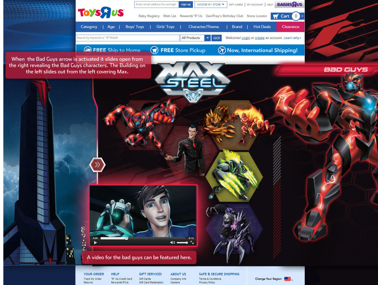
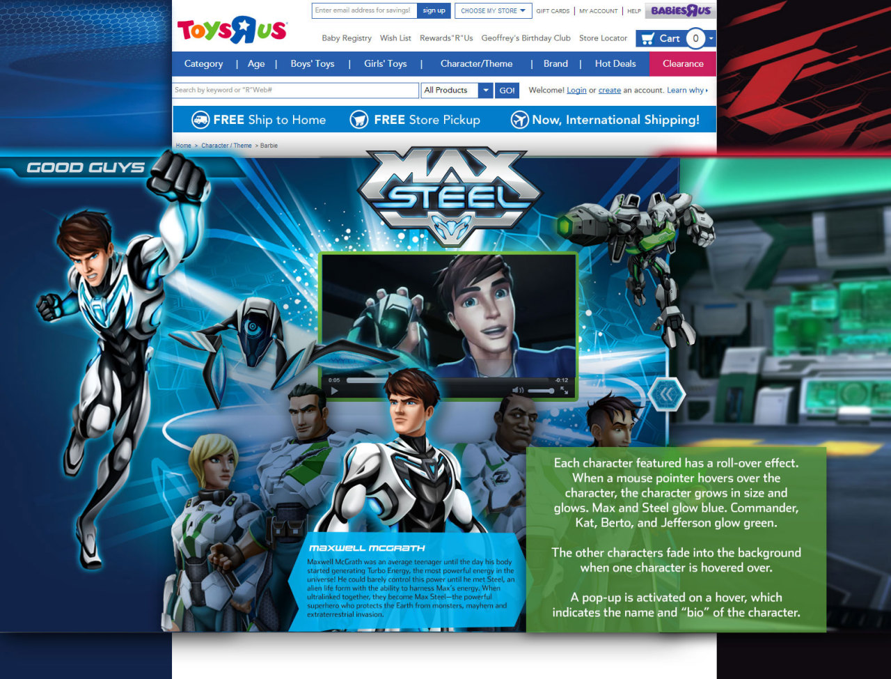
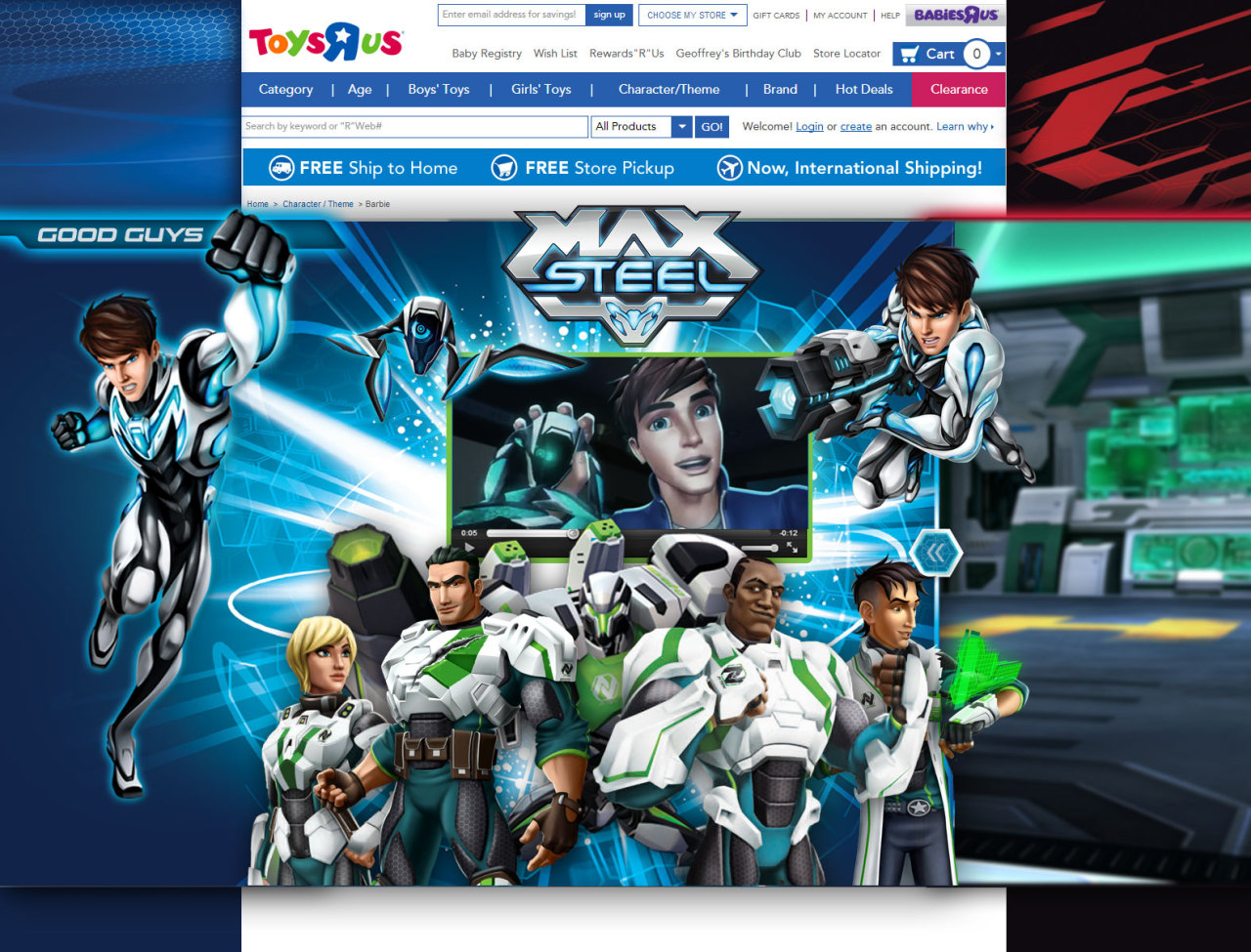
An animated experience built into the Toys"R"Us site. Kids could explore the world, meet the characters and watch the commercial — then jump back to the retail page to buy the toys. Introduced the brand to children and made the experience engaging for kids and parents alike, in an era when mobile-friendliness was barely a thing.

8b · Animation + brand storytelling

The Fisher-Price History Timeline.

An animated timeline walking users through how Fisher-Price was created — with little animated toys and objects along the way. Built in Adobe Edge, when HTML5 animation was the new frontier.

8c · Interactive games

Games for kids.

Browser games built around the brands — like a Little People "What's Different?" spot-the-difference game — giving kids a reason to stay, play, and come back. Simple, colorful, and click-friendly for small hands, in the Flash-to-HTML5 transition era.

Two Fisher-Price email campaign mockups — an Our Favorite Shopper promo and a Save up to $100 promo
8d · Email campaigns

Across every brand under the umbrella.

Email campaigns for the full portfolio — Little People, Thomas & Friends and more — including promotional sends and "Moments of Joy" features. Two of the store-side promo sends shown here.

8e · The Fisher-Price site

The full working site build.

A rebuild of the Fisher-Price.com homepage as it existed during this era — hero band, category grid, brand cards, the rest. A snapshot of how the brand was meeting parents online at the time.

Open the live rebuild ↗
09 — What I'd do differently

The craft was strong. What was missing was measurement.

At the time, performance data wasn't shared with designers — UX as a discipline barely existed, and we weren't part of that conversation. Looking back, that's the thing I'd change. With the engagement data we now treat as standard, I'd have closed the loop: testing gameplay flows, iterating on what kids actually played longest, and letting real behavior — not just brand instinct and marketing goals — drive the next version. The instinct-driven craft was strong; what was missing was measurement. Knowing what I know now, I'd design for measurement from day one. That gap is exactly what drew me toward UX. — Jessa Wolfe
10 — Close

A formative four years.

Dozens of campaigns. Every brand under the Fisher-Price umbrella. A role that stretched from storyboard to front-end build — and the foundation for how I think about playful, human-centered design today.