VANTA
Built to Move
A performance sportswear brand built from a blank page, driven by one question: what makes someone stop scrolling and feel something before they read a single word?
Most sportswear sites move the same way. VANTA was an exercise in the opposite.
Most direct-to-consumer sportswear sites run the same playbook: a stock hero slider, colour spread thin and evenly across the page, safe system type, and a wall of product below the fold. Competent — and completely forgettable.
I wanted to build a brand from nothing with a point of view committed to fully, where every decision laddered back to a single idea.
Built to
Move
The line came first; the brand followed. "Built to Move" had to carry three very different people at once — the sprinter, the person on the mat, and someone out walking the dog on a Sunday. So I didn't build it around a type of athlete. I built it around motion as a way of living — intensity, focus, and ease, held in the same frame.
Built on restraint
Colour
Near-black and a warm off-white, with a single electric orange as the only accent — and the rule to use it almost nowhere. One loud colour used sparingly reads as confidence; spread everywhere it reads as noise.
Typography
A heavy condensed display face against a clean, quiet grotesque. The display shouts at enormous sizes; the body stays out of the way. The outlined word became the brand's signature.
Motion
Reserved for a few high-impact moments rather than scattered everywhere. Sparse motion feels expensive; constant motion feels cheap.
- Black page-load wipe
- Staggered scroll reveals
- A slow parallax drift
- Product cards that stay still until you touch them
Layout
Editorial rhythm — numbered section markers, a marquee ticker, generous negative space against controlled density. It borrows the proven conversion skeleton of good commerce, but executes it with a point of view.
Sparse motion feels expensive. Constant motion feels cheap.
Four sports. One frame.
The hero is a four-part cinematic reel that plays in sequence and loops. The discipline was in the lighting: every clip shares one language — desaturated and high-contrast, deep shadow, a single warm rim of orange. Four separate scenes that read as one shoot. That consistency is what turns a pile of clips into a campaign.
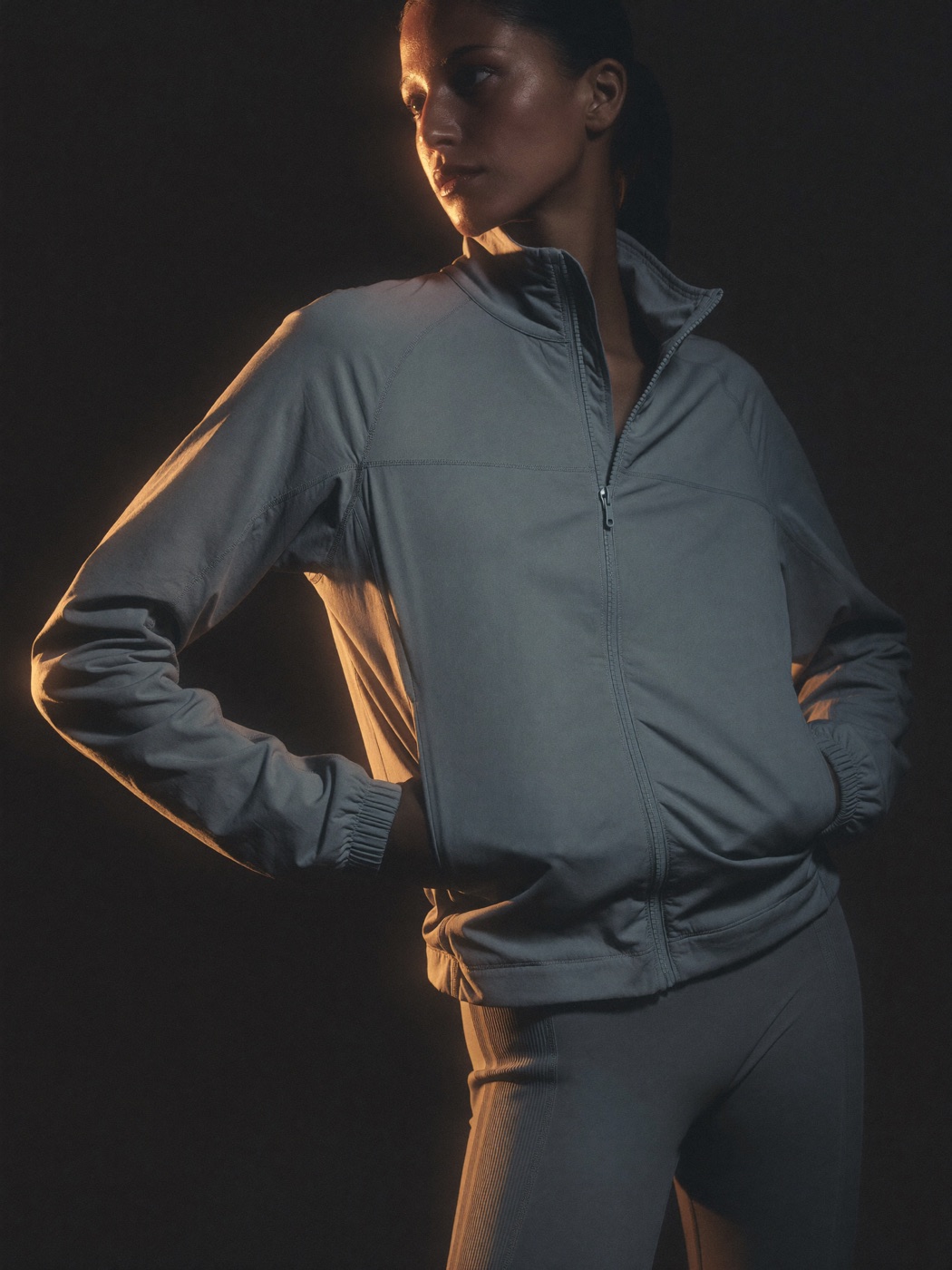
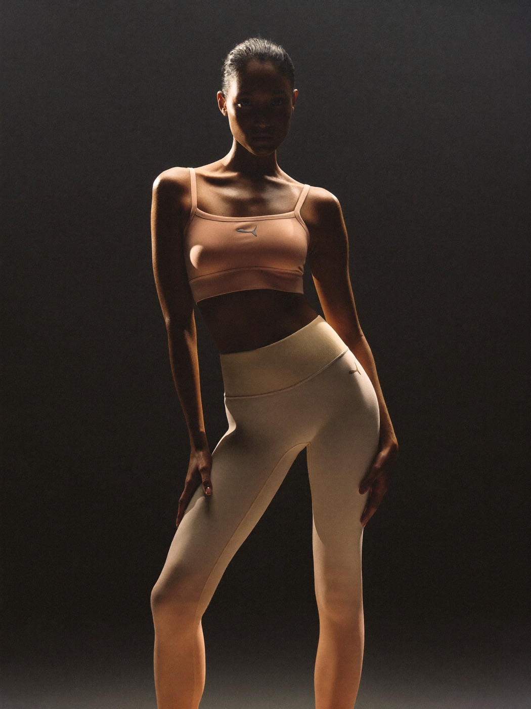
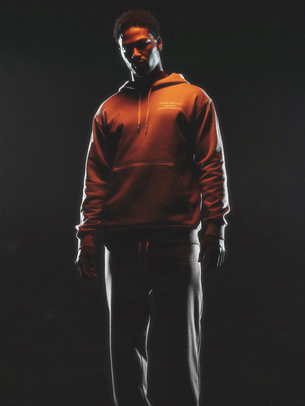
Shot as one campaign
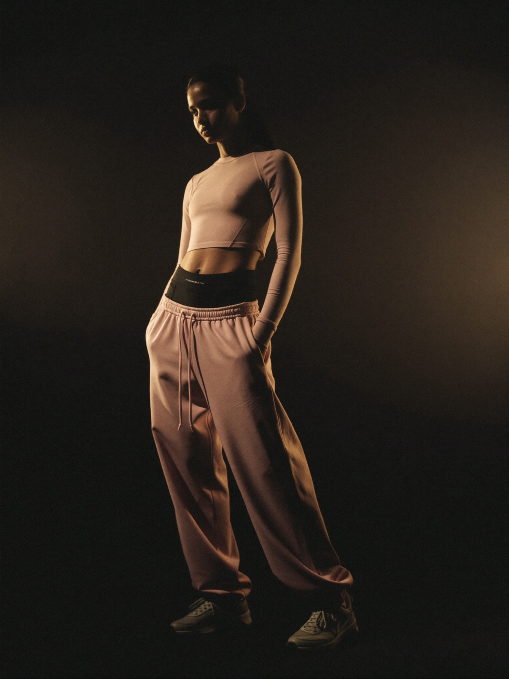
The full catalogue was art-directed to a single recipe — apparel on-model, framed like an editorial campaign; gear shot solo against black with the orange as the one pop of colour — so the grid feels like one brand, not a stock library.
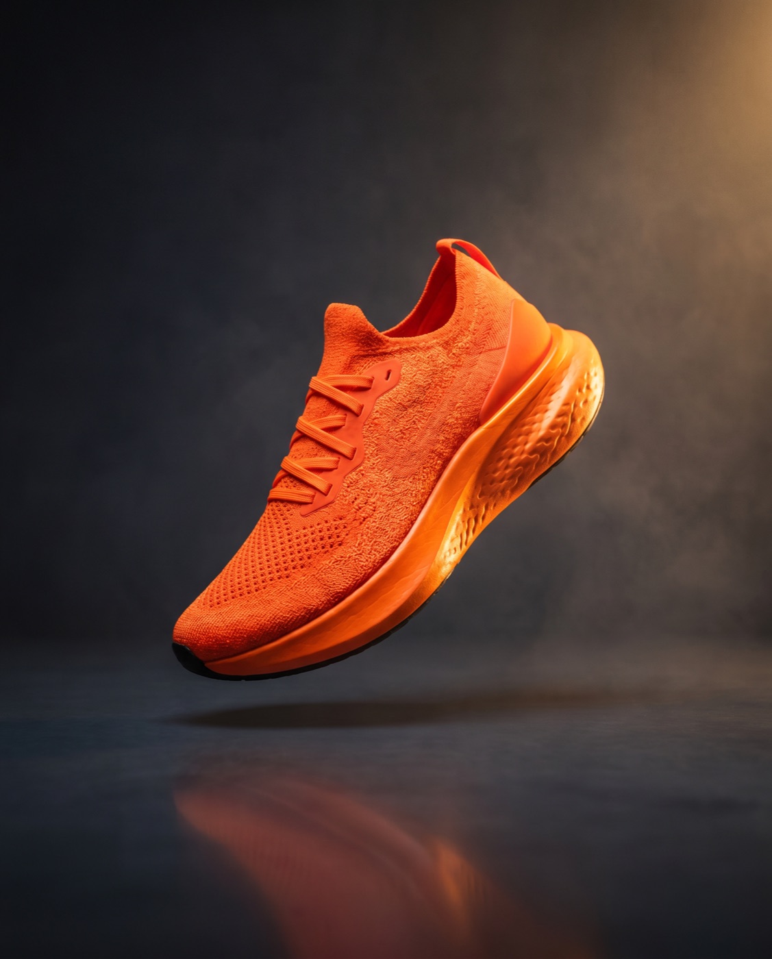


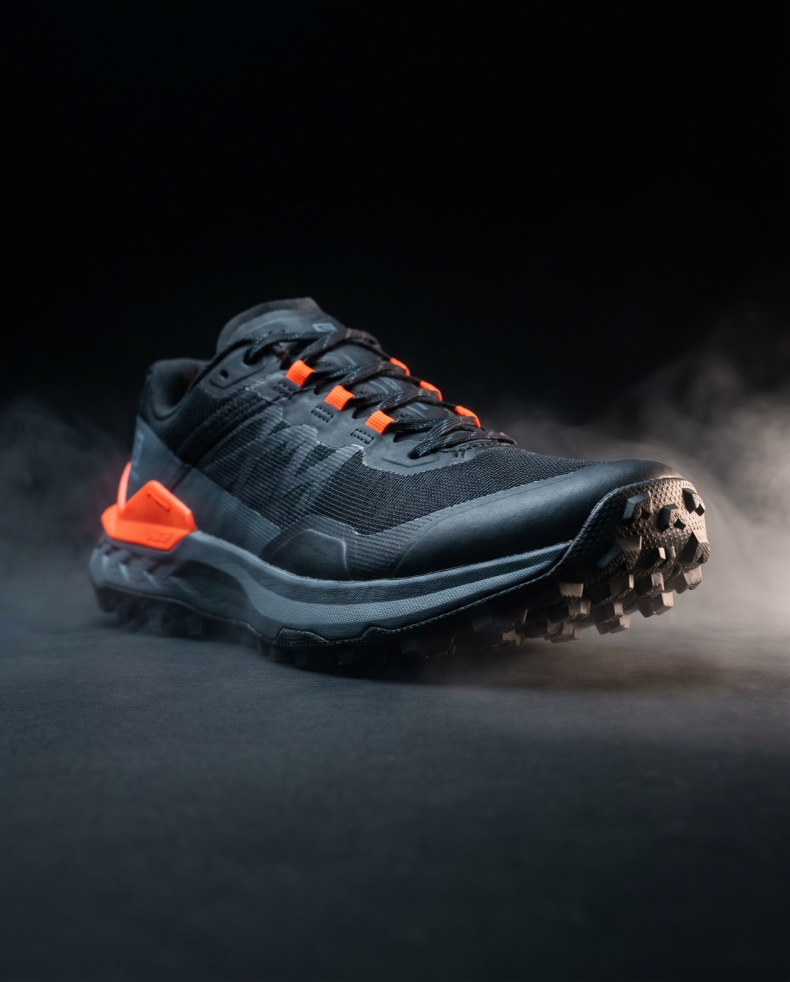
Slow-spinning product vignettes
An orange hero shoe, a monochrome counterpart — looping vignettes give the lookbook a hypnotic, premium beat that a flat still never could.
A working storefront, not a landing page
A filtered shop, product pages with size selection and specs, a slide-out cart with live quantity, and a full checkout. Mobile-first, with every grid reflowing cleanly. The craft, again, is in the restraint — enough interaction to feel alive, never enough to get in the way of buying.

The gap between competent and memorable isn't budget. It's a point of view, committed to fully.
VANTA picks an extreme — monochrome with one loud accent, oversized condensed type, motion held in reserve — and executes it with precision down to the hairline. Nothing here is decoration for its own sake; every choice points back at Built to Move.
Taken from concept to a live, interactive build using an AI-assisted production pipeline for the film and imagery — the same direction-led thinking, delivered at a speed that lets ideas be seen, tested, and refined the same day.


